Grand Canyon Tour and Travel
Usability Study & Website Redesign
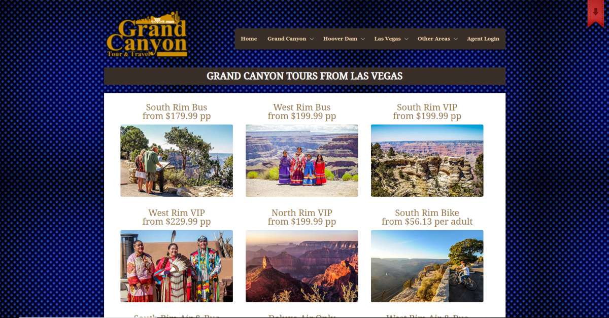
Grand Canyon Tour and Travel’s website was in clear need of a redesign. Through multiple rounds of usability testing, problems were identified and the site structure and layout were redesigned. This resulted in a site with improved navigation menus, consistent naming systems, and an overall cleaner appearance.
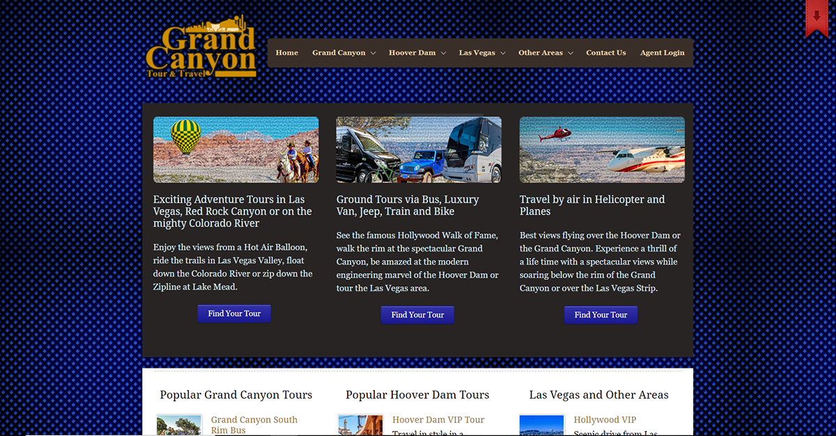
Original Website
The site's cluttered layout and disorganized structure made it frustrating to navigate and find information.
Testing & Analysis
Testing began with conducting a heuristic analysis, followed by card sorting and questionnaire surveys sent out to potential users, and finally in-person observational testing. The biggest issues identified were confusing tour organization and difficulty finding general tour information and FAQs.
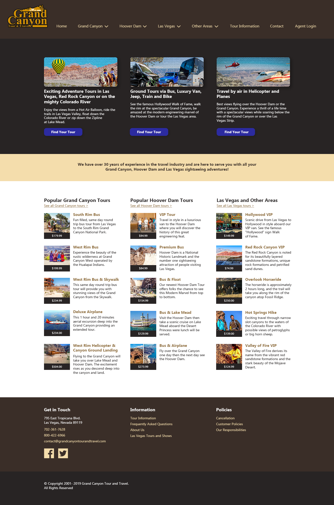
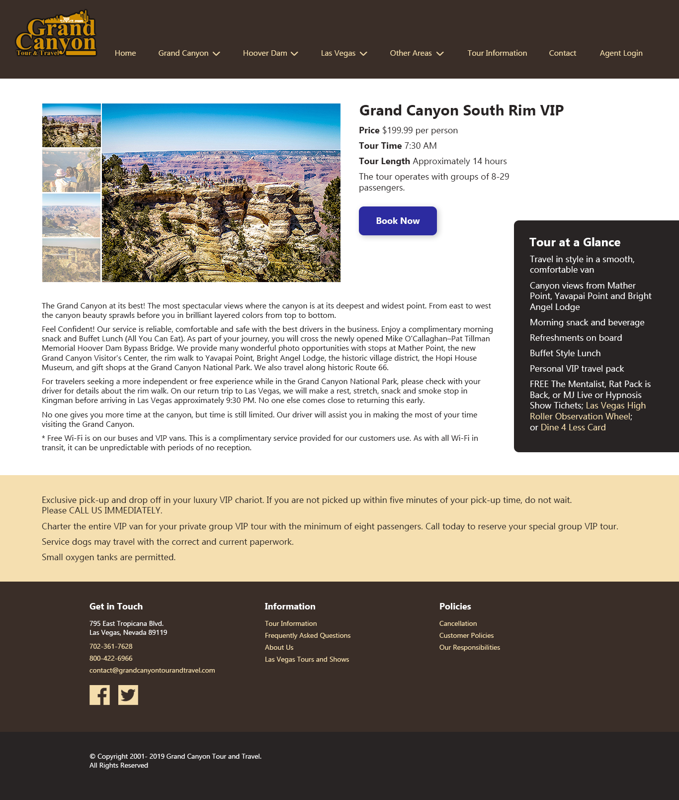
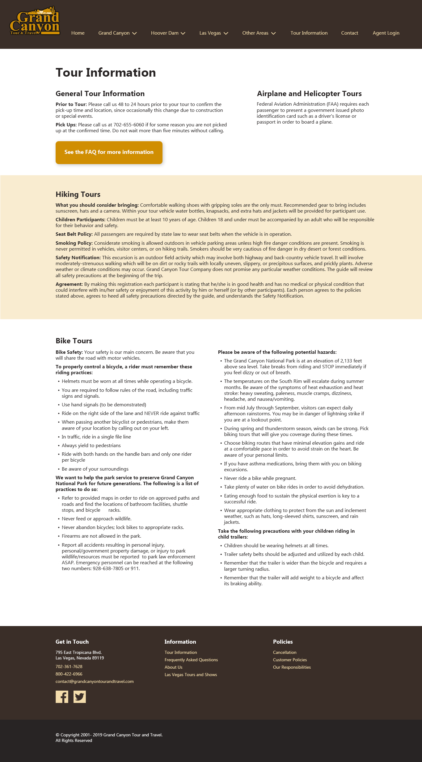
The tour naming system was standardized, and sub-categories were added to the dropdown menu. The tour information page was moved to the main navigation instead of being stuck in the footer, and a clear link to the FAQ page was added to the tour information.
Mockups
Based on the research results, mockups of the redesigned site were created in Photoshop.